
Property · Estate agency · London and Essex
Bricks Estate Agents
The brand, car wraps, print, social media, website and search for an independent estate agency in Buckhurst Hill and London.
I worked with Bricks from the day it was formed in 2021 until 2025.
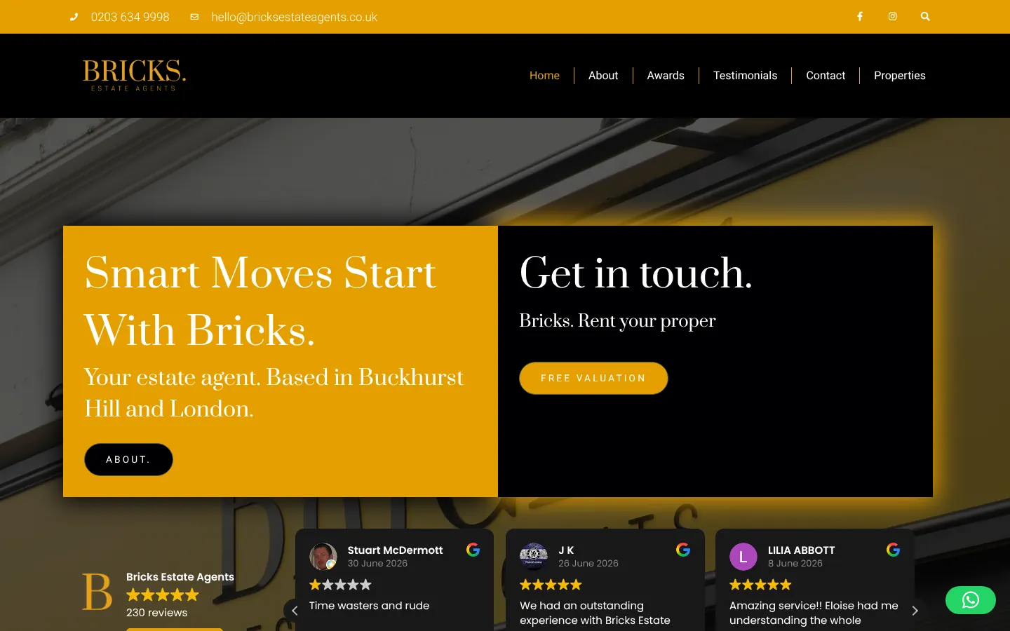

Their brand
BRICKS. in a classic serif, gold on black, full stop included.
- Gold
- Black
- Graphite
- Stone grey
- White
Type
Prata · Roboto
Build record
- Problem
- A new independent agency up against national chains in some of the busiest postcodes around London, and needing to look established from day one.
- Built
- The brand, the wraps on the agency’s cars, boards, brochures and stationery, the website with live property listings and area guides, search, and the agency’s Instagram through 2022.
- Stack
- WordPress, hosted and looked after by me, with listings that flow in automatically from the agency’s property system; structured data for search; WhatsApp contact.
- Live
- 2021–2025, from the agency’s first day.
Figures
- Pages on the website
- 24
- Local area guides
- 5
- Brand, from logo to car wrap
- 1
- Instagram posts in 2022
- 250+
Sellers decide whether to trust an estate agent before they’ve met anyone. They go by the board outside a house, the car on the high street, or the first page of a website. Bricks is an independent agency in Buckhurst Hill and London, up against national chains with much bigger budgets, so all of those had to look like a name people already knew.
I worked with them on all of it, from the day the agency was formed in 2021 until 2025.
The brand
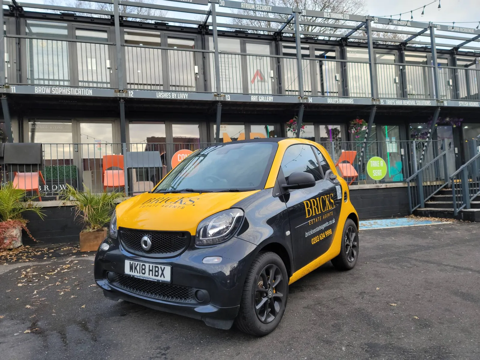
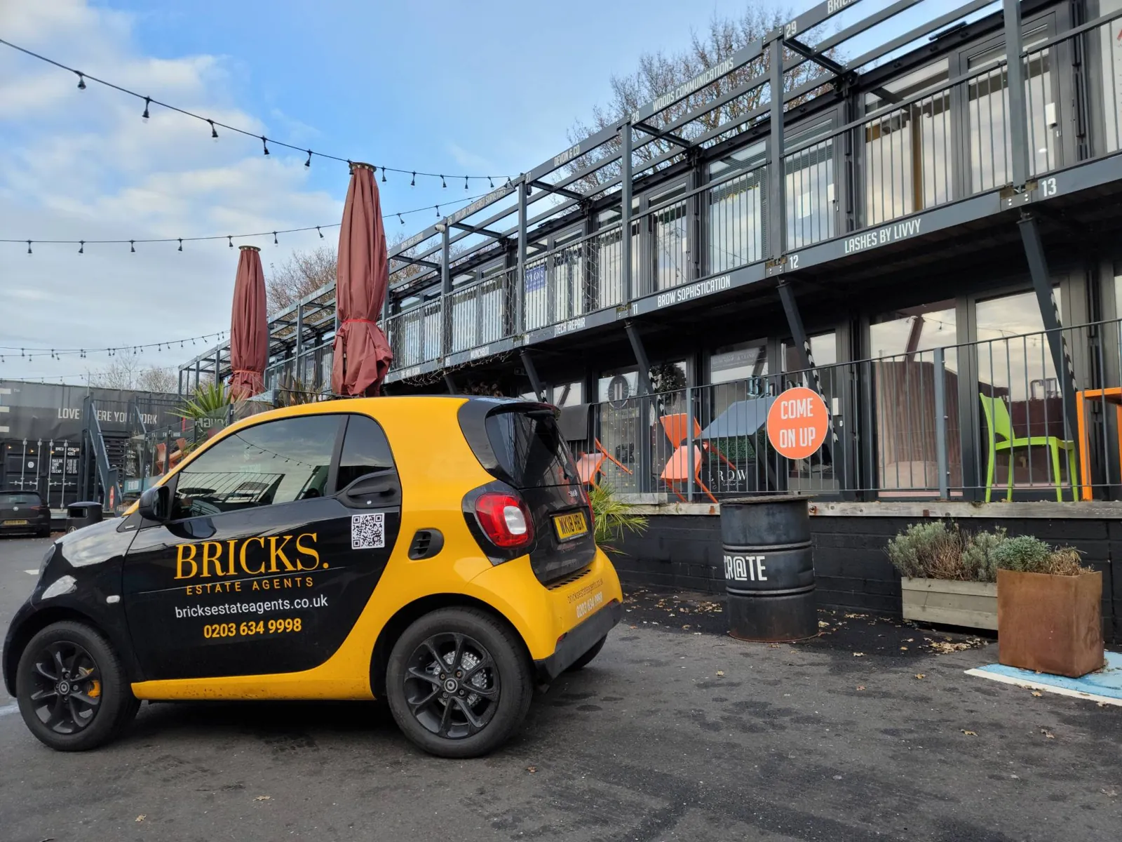
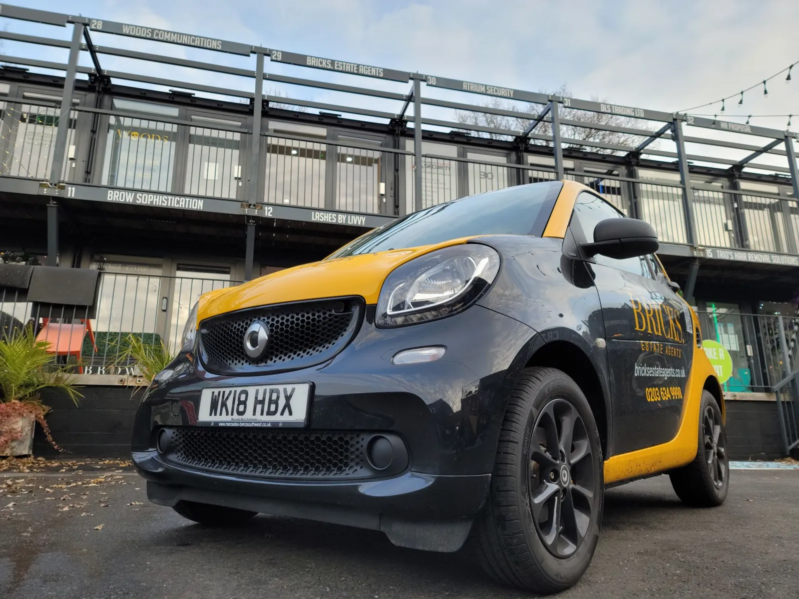
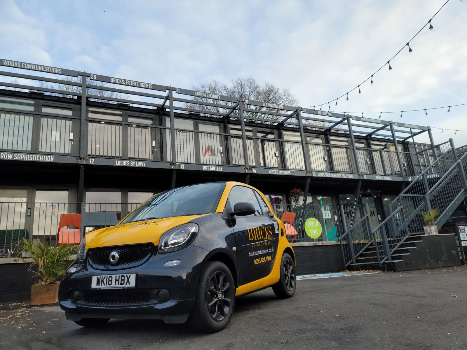
BRICKS. is set in a classic serif, gold on black, full stop included. It looks premium without looking stuffy, and it works everywhere it needs to: on screen, on social media, and on the agency’s cars, which carry the brand as much as the website does.
On paper and on the street
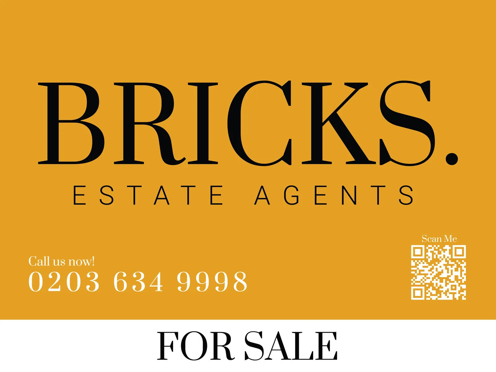
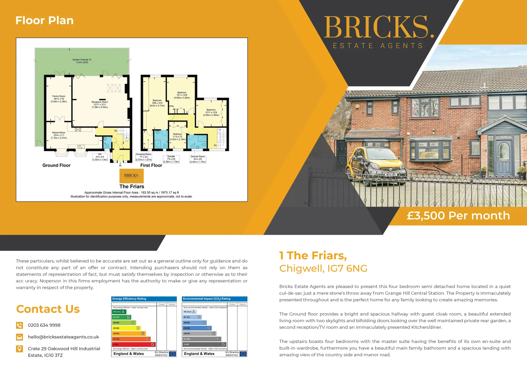
An estate agent’s name is seen most on things people walk past or pick up. I designed the For Sale and To Let boards, the property brochures with their floor plans, the folder a seller is handed at a valuation, business cards, letterheads and email signatures, the letters that go through doors near a sale, a local magazine advert and the header on the agency’s Rightmove page. All of it in the same gold and black, so a board in a front garden and the car parked outside look like one firm.
Social media
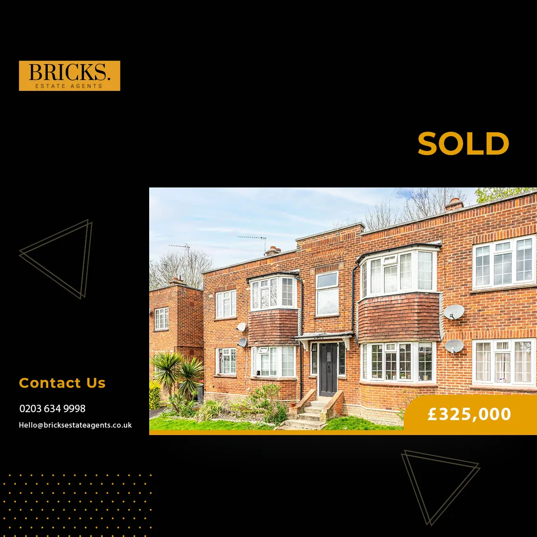
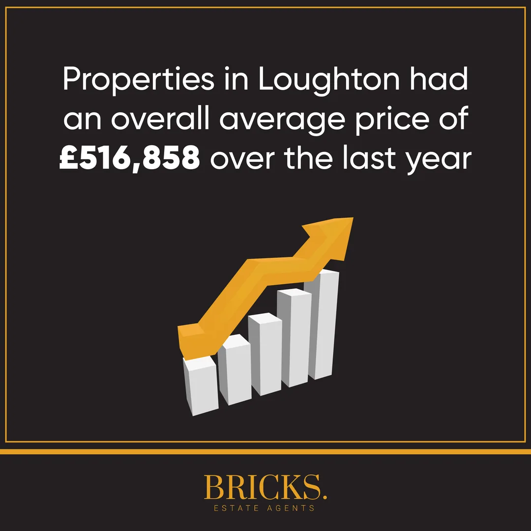
Through 2022 I ran the agency’s Instagram, designing and posting more than 250 posts to a weekly rhythm. New instructions went up as they came in, then let agreed or sold as they went, with a round-up of the week every Friday, local price figures, reviews and short videos of homes. A set of profile graphics, covers and highlight icons kept every post looking like the same agency.
The website
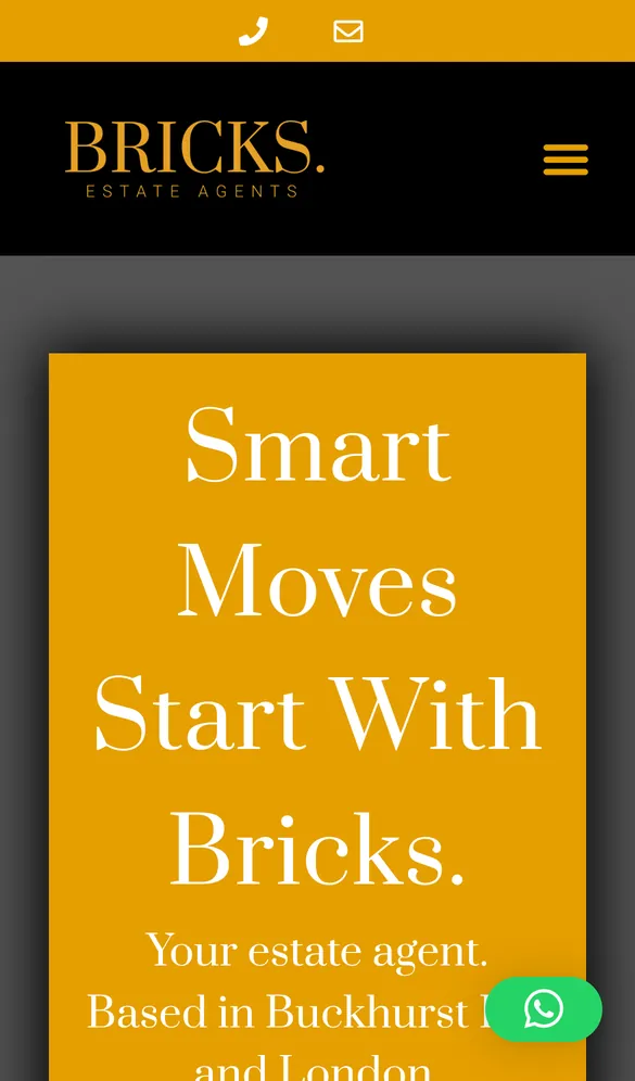
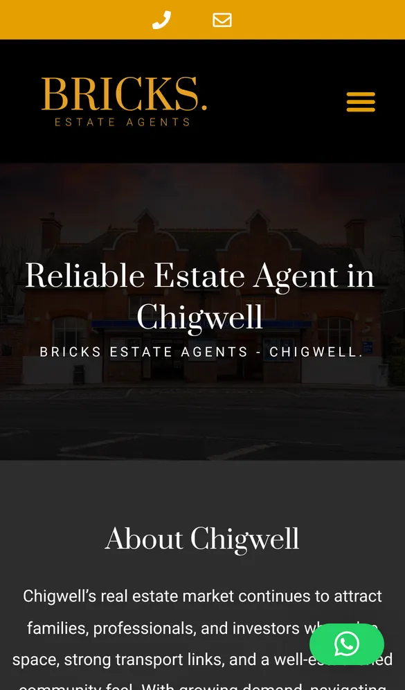
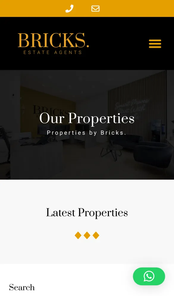
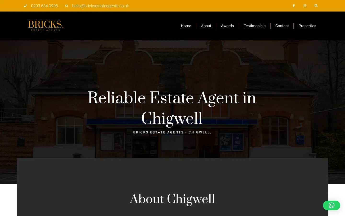
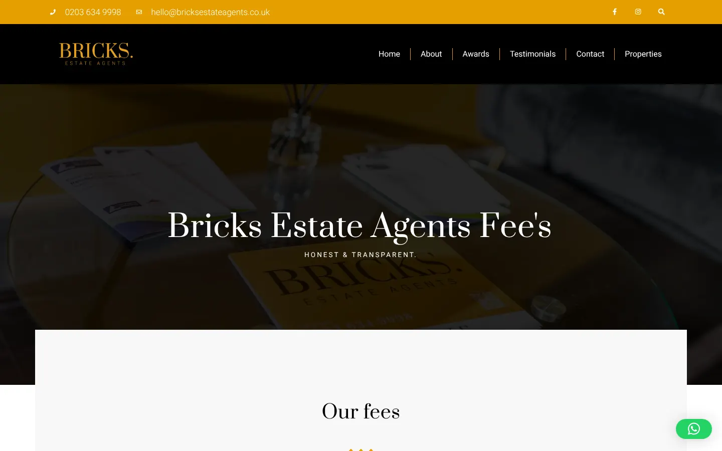
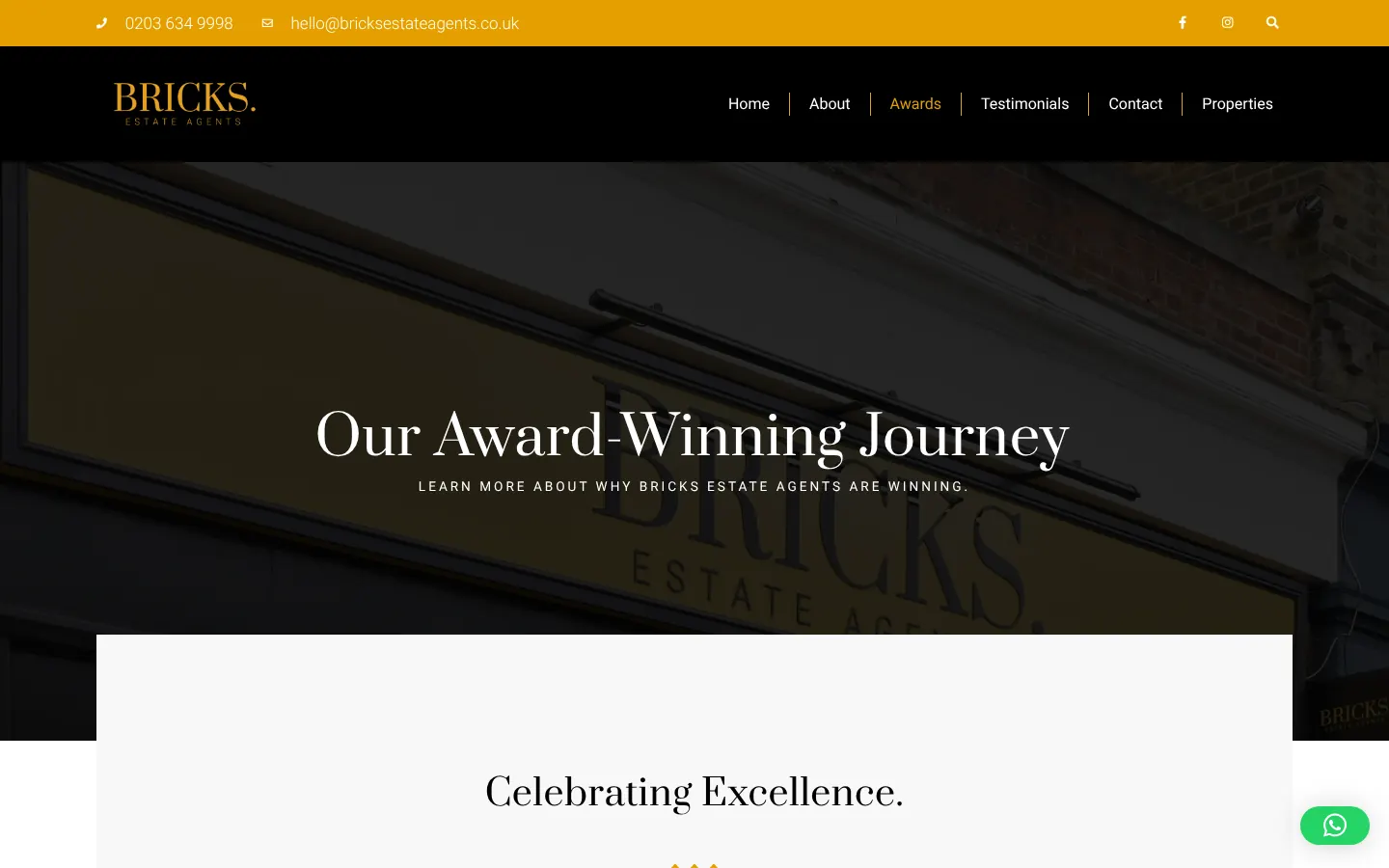
The website covers everything a buyer, seller or landlord might come looking for. Listings come in automatically from the agency’s property system, so nobody copies them across by hand. There are guides to the areas the agency covers (Buckhurst Hill, Chigwell, Loughton, South Woodford and Canary Wharf), a clear fees page, answers to common questions, the agency’s story, reviews, its awards and its latest Instagram posts. Wherever you land, a valuation, a call or a WhatsApp is one tap away. I hosted the site as well, and looked after the infrastructure behind it.
Search
The site is set up so search engines can tell exactly what it is: an estate agency, where it works, what it offers and what its customers say. The area guides do the local work, each one written about a place the agency knows well. I looked after the search side for the four years I worked with them.

Want something like this?
Tell me what you’re working on, and I’ll tell you straight whether I can help.
I read every enquiry myself and reply in writing, usually within a working day.
Similar work
- BG DecoratorsA new website for a family decorating firm in Hertfordshire, built so people searching locally actually find it.Decorating
- Red Air MediaA faster website on its existing hosting, then three months of SEO and six months of UK-wide Google Ads, for a specialist drone and aerial media company.Aerial media

